Friday, November 23, 2018

React Native - ActivityIndicator

React Native - ActivityIndicator
Image result for React Native - ActivityIndicator ANIMATED]
In this course, we will be taking a look at how to make use f the activity indicator in react native.

Step 1: App

your App component will be used to import and show our ActivityIndicator.

App.js

import React from 'react'
import ActivityIndicatorExample from './activity_indicator_example.js'

const Home = () => {
   return (
      <ActivityIndicatorExample />
   )
}
export default Home

Step 2: ActivityIndicatorExample

Animating property is a Boolean which is used for showing the activity indicator. The latter closes six seconds after the component is mounted. This is done using the closeActivityIndicator() function.

activity_indicator_example.js

import React, { Component } from 'react';
import { ActivityIndicator, View, Text, TouchableOpacity, StyleSheet } from 'react-native';

class ActivityIndicatorExample extends Component {
   state = { animating: true }
   
   closeActivityIndicator = () => setTimeout(() => this.setState({
   animating: false }), 60000)
   
   componentDidMount = () => this.closeActivityIndicator()
   render() {
      const animating = this.state.animating
      return (
         <View style = {styles.container}>
            <ActivityIndicator
               animating = {animating}
               color = '#bc2b78'
               size = "large"
               style = {styles.activityIndicator}/>
         </View>
      )
   }
}
export default ActivityIndicatorExample

const styles = StyleSheet.create ({
   container: {
      flex: 1,
      justifyContent: 'center',
      alignItems: 'center',
      marginTop: 70
   },
   activityIndicator: {
      flex: 1,
      justifyContent: 'center',
      alignItems: 'center',
      height: 80
   }
})
When we run the app, we will see the loader on screen. It will disappear after six seconds.
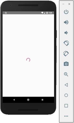
React Native Activity Indicator


Continue reading

REACT NATIVE PICKER

REACT NATIVE PICKER
Image result for REACT PICKER ANIMATED]

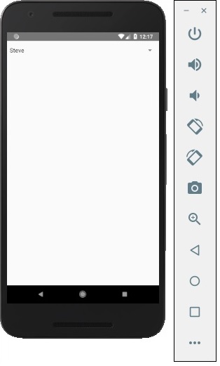
In this chapter, we will create simple Picker with two available options.

Step 1: Create File

Here, the App.js folder will be used as a presentational component.

App.js

import React from 'react'
import PickerExample from './PickerExample.js'

const App = () => {
   return (
      <PickerExample />
   )
}
export default App

Step 2: Logic

this.state.user is used for picker control.
The updateUser function will be triggered when a user is picked.

PickerExample.js

import React, { Component } from 'react';
import { View, Text, Picker, StyleSheet } from 'react-native'

class PickerExample extends Component {
   state = {user: ''}
   updateUser = (user) => {
      this.setState({ user: user })
   }
   render() {
      return (
         <View>
            <Picker selectedValue = {this.state.user} onValueChange = {this.updateUser}>
               <Picker.Item label = "Steve" value = "steve" />
               <Picker.Item label = "Ellen" value = "ellen" />
               <Picker.Item label = "Maria" value = "maria" />
            </Picker>
            <Text style = {styles.text}>{this.state.user}</Text>
         </View>
      )
   }
}
export default PickerExample

const styles = StyleSheet.create({
   text: {
      fontSize: 30,
      alignSelf: 'center',
      color: 'red'
   }
})

Output

React Native Picker
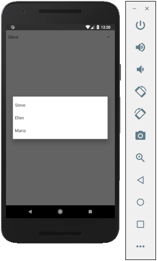
If you click on the name it prompts you all three options as −
React Native Picker
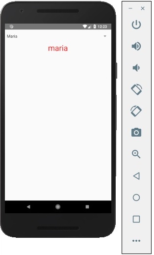
And you can pick one of them and the output will be like.
React Native Picker

Continue reading

REACT NATIVE AND STATUS BAR

REACT NATIVE AND STATUS BAR
In this chapter, we will show you how to control the status bar appearance in React Native.

Image result for STATUS BAR ANIMATED]
The Status bar is easy to use and all you need to do is set properties to change it.
The hidden property can be used to hide the status bar. In our example it is set to false. This is default value.
The barStyle can have three values – dark-content, light-content and default.
This component has several other properties that can be used. Some of them are Android or IOS specific. You can check it in official documentation.

App.js

import React, { Component } from 'react';
import { StatusBar } from 'react-native'

const App = () => {
   return (
      <StatusBar barStyle = "dark-content" hidden = {false} backgroundColor = "#00BCD4" translucent = {true}/>
   )
}
export default App
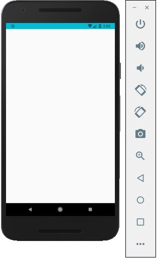
If we run the app, the status bar will be visible and content will have dark color.

Output

React Native Status Bar

Continue reading

REACT NATIVE SWITCH

REACT NATIVE SWITCH
In this chapter, we will explain the Switch component in a couple of steps.

Image result for REACT SWITCH ANIMATED]


Step 1: Create File

We will use the HomeContainer component for logic, but we need to create the presentational component.
Let us now create a new file: SwitchExample.js.

Step 2: Logic

We are passing value from the state and functions for toggling switch items to SwitchExample component. Toggle functions will be used for updating the state.

App.js

import React, { Component } from 'react'
import { View } from 'react-native'
import SwitchExample from './switch_example.js'

export default class HomeContainer extends Component {
   constructor() {
      super();
      this.state = {
         switch1Value: false,
      }
   }
   toggleSwitch1 = (value) => {
      this.setState({switch1Value: value})
      console.log('Switch 1 is: ' + value)
   }
   render() {
      return (
         <View>
            <SwitchExample
            toggleSwitch1 = {this.toggleSwitch1}
            switch1Value = {this.state.switch1Value}/>
         </View>
      );
   }
}

Step 3: Presentation

Switch component takes two props. The onValueChange prop will trigger our toggle functions after a user presses the switch. The value prop is bound to the state of the HomeContainer component.

switch_example.js

import React, { Component } from 'react'
import { View, Switch, StyleSheet }

from 'react-native'

export default SwitchExample = (props) => {
   return (
      <View style = {styles.container}>
         <Switch
         onValueChange = {props.toggleSwitch1}
         value = {props.switch1Value}/>
      </View>
   )
}
const styles = StyleSheet.create ({
   container: {
      flex: 1,
      alignItems: 'center',
      marginTop: 100
   }
})
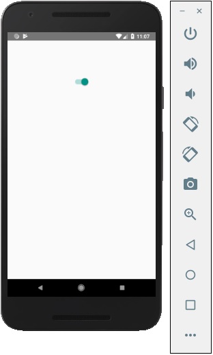
If we press the switch, the state will be updated. You can check values in the console.

Output

React Native Switch

Continue reading